Xfinity Constant Guard Redesign
The Constant Guard website was redesigned to clearly communicate the value and features of its security application suite, improve usability across devices, and drive customer engagement. Following the redesign, site engagement, mobile visits, and SEO rankings all increased.
-
Brand Confusion: Customers struggled to understand the relationship between Constant Guard and Norton, the most valuable free offering in the suite.
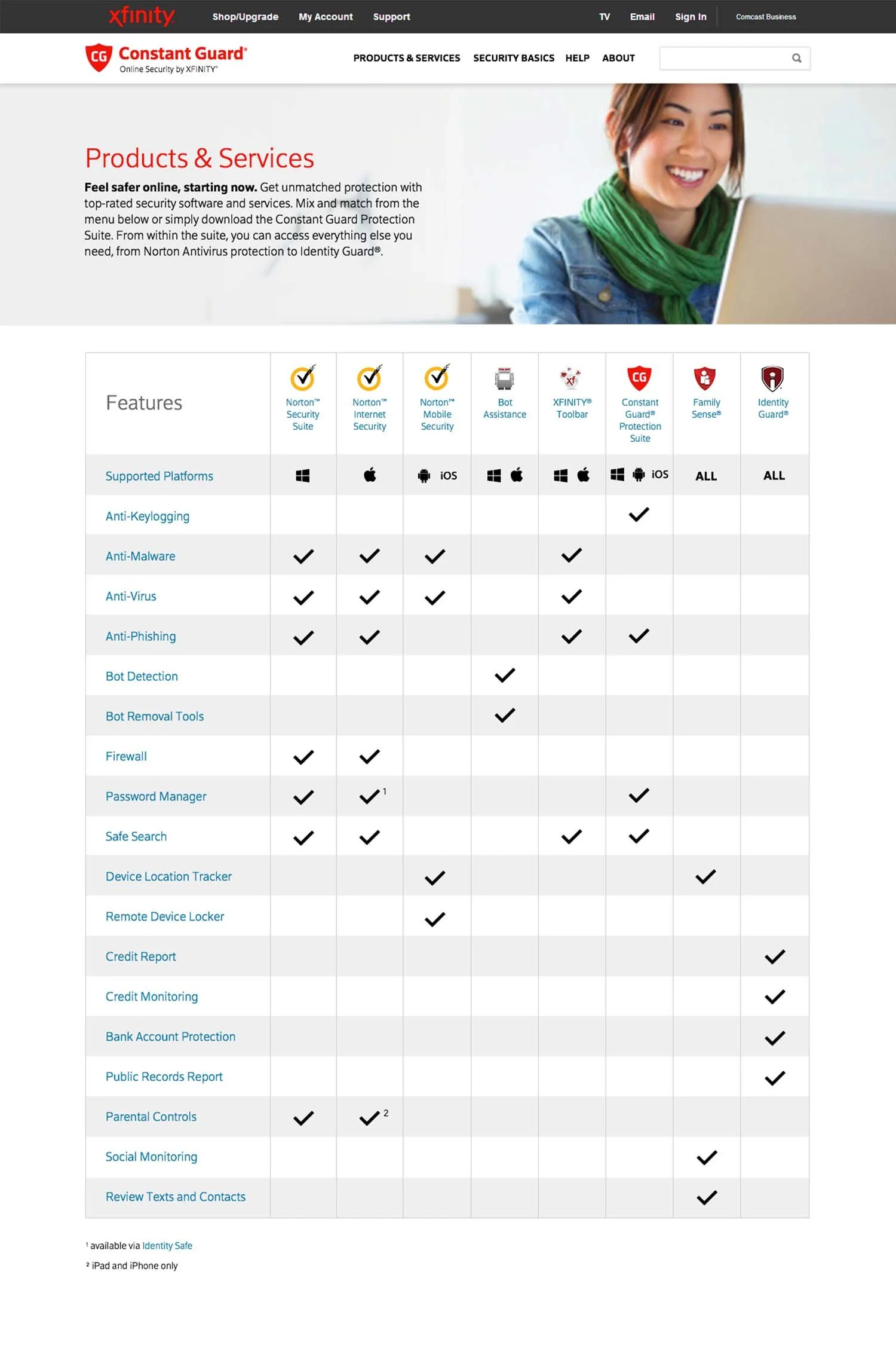
Inconsistent Product Information: Security applications lacked standardized descriptions, making features and benefits difficult to compare.
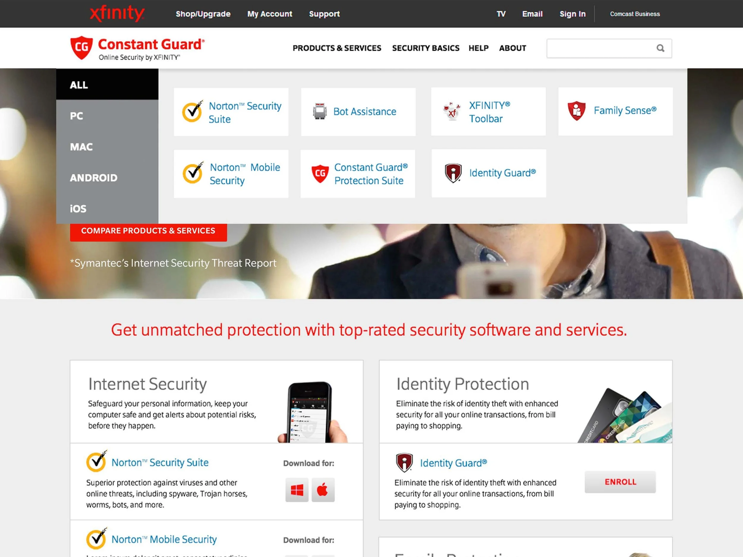
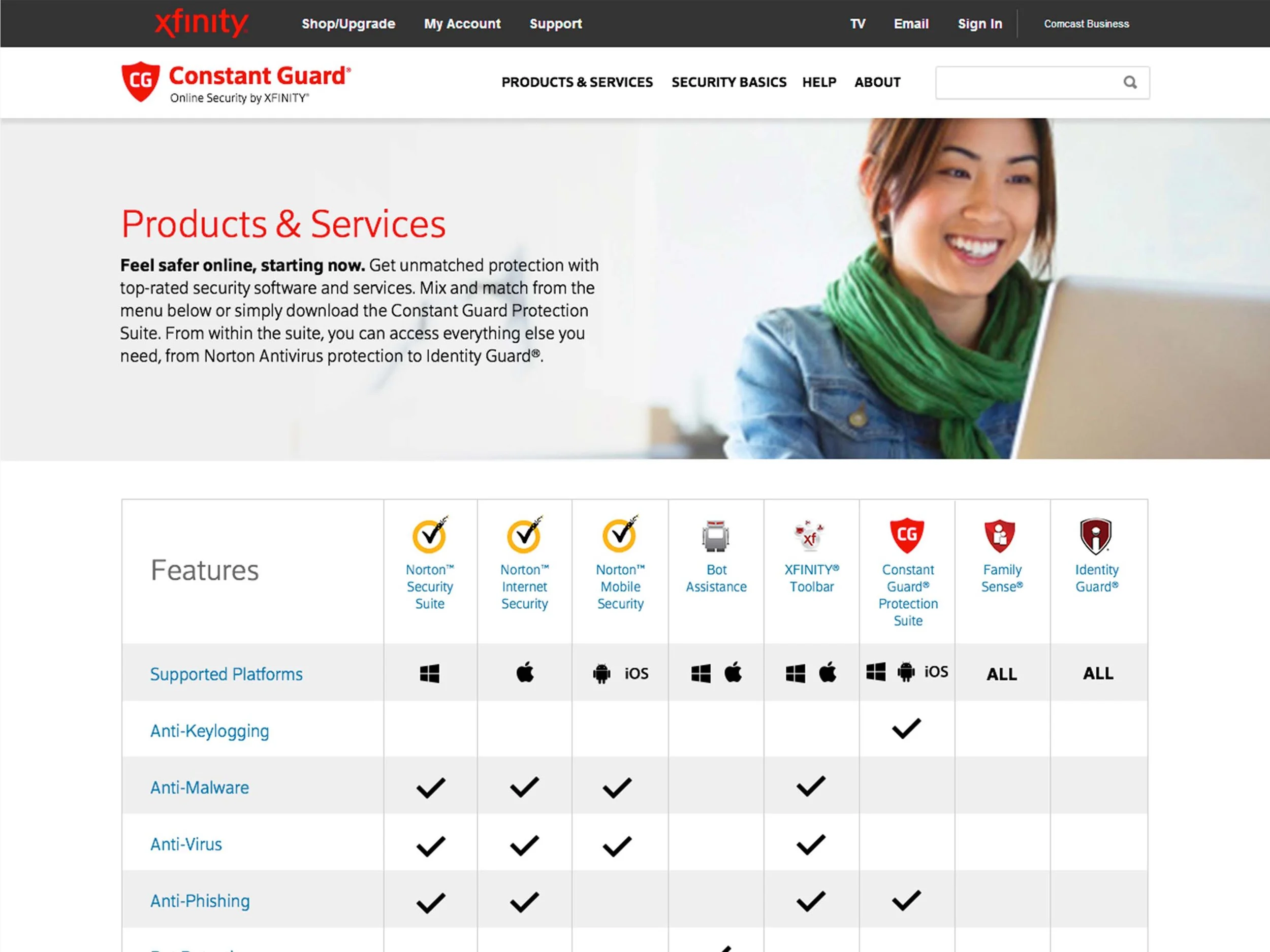
Poor Information Architecture: Products were not grouped by purpose or security need, creating a fragmented user experience.
Limited Mobile Experience: The site was not responsive, resulting in usability issues across devices.
-
Content & UX Audit: Reviewed site structure, analytics, and user behavior to identify navigation and messaging gaps.
Information Architecture: Reorganized content to clarify the relationship between Constant Guard, Norton, and other security applications.
Responsive Design: Created mobile-first wireframes and prototypes to improve usability across devices.
-
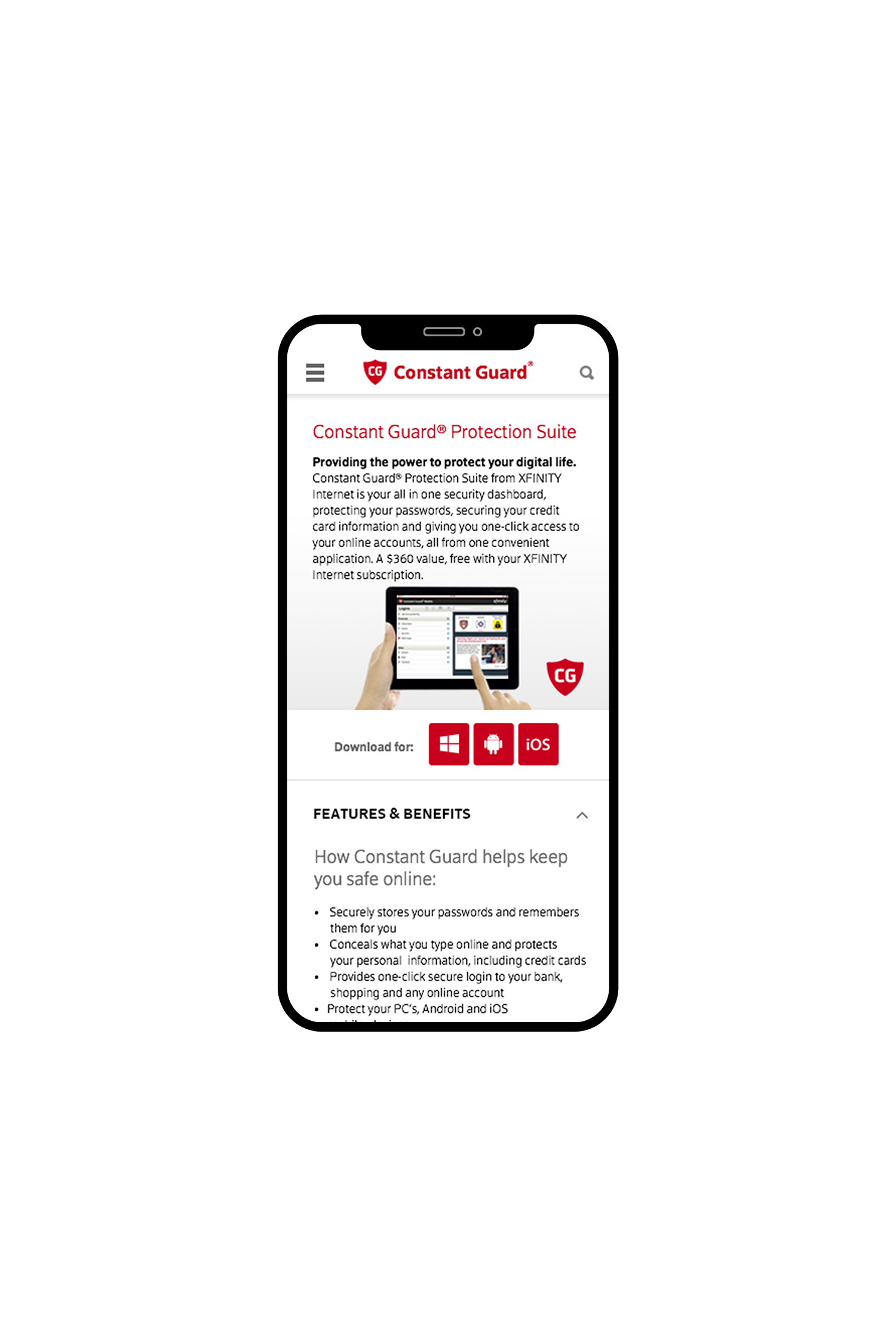
Clear Product Positioning: Defined Constant Guard as a security suite and clarified the role of each application within it.
Consistent Product Messaging: Standardized product descriptions, features, and benefits across all application pages.
Comparison Tools: Introduced side-by-side comparisons to help customers understand available security options.
Responsive & SEO-Friendly Experience: Implemented a fully responsive design and optimized site structure for search visibility.
-
Mobile Growth: Mobile visits increased by 59%, reflecting the success of the responsive experience.
Improved Search Visibility: SEO rankings increased by 7.7%, driving greater organic traffic.
Enhanced Product Discovery: Customers could more easily understand and compare security offerings.

Home
Navigation
Products & Services
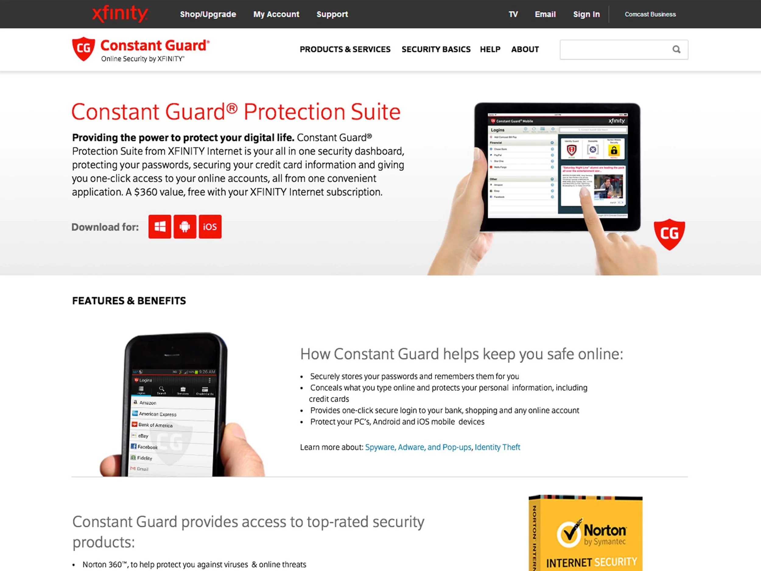
Constant Guard Protection Suite
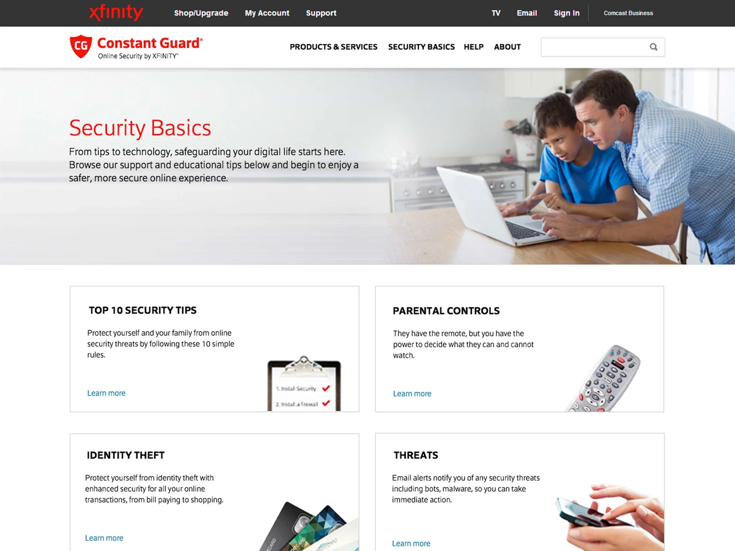
Security Basics
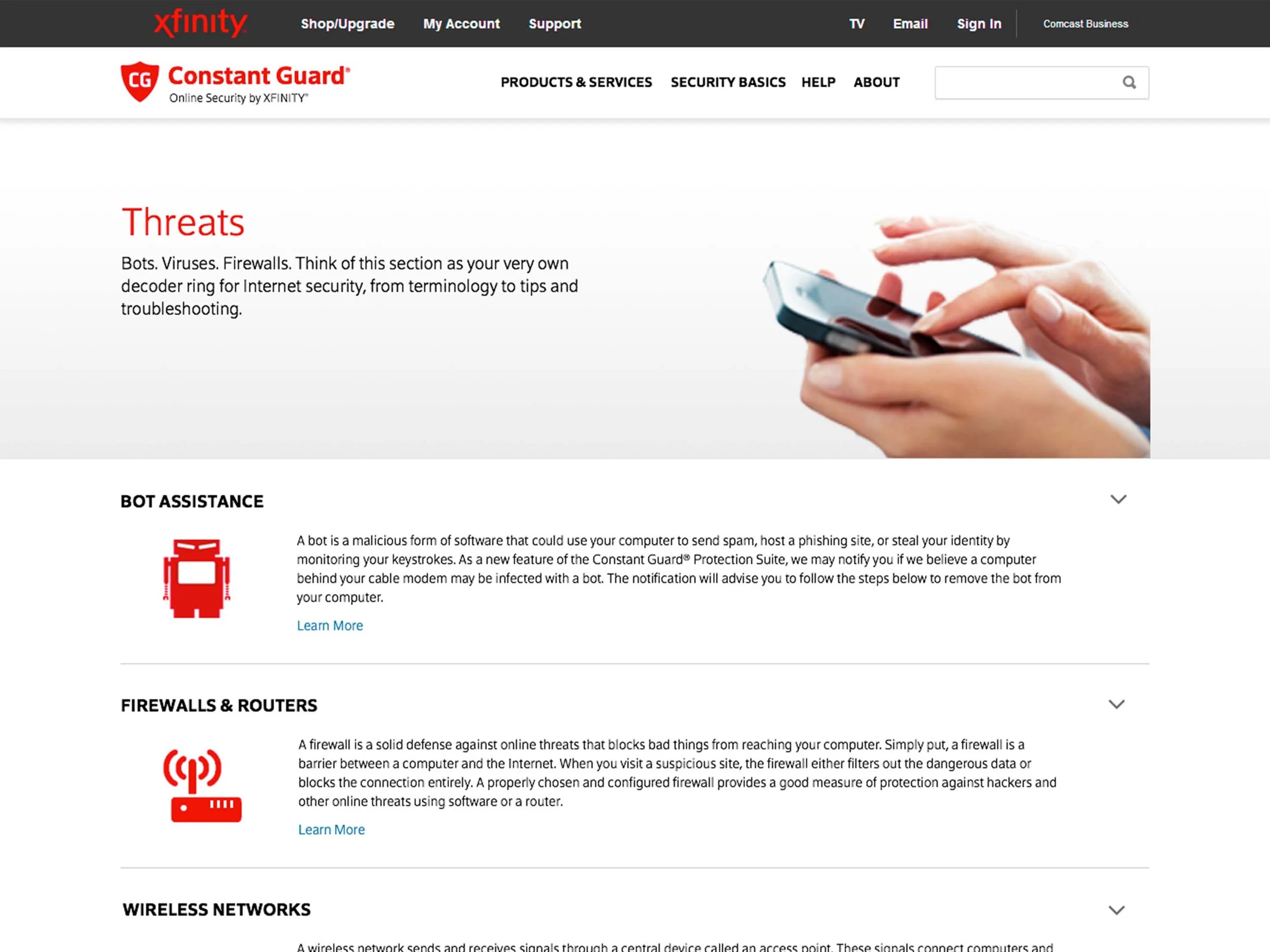
Threats
About